Friday, January 31, 2014

Thinking about the sun when lighting the model

When lighting the model with a spotlight,  I often think in terms of the sun, even though I am indoors. We begin with a single lamp on a stand. Ideally, the room will be filled with some ambient or diffused light and the spotlight will provide highlights and shadows. This is similar to the way that the sun provides a direct light source while the atmosphere and environment scatters light to fill the shadows of the figure with detail. If you can, find a way to bounce reflected light from a wall opposite the lamp or place the model between the lamp and the soft light of a northern window covered with a sheer curtain to get this same effect.

I think about the sun when lighting the model because I know that everything we do in a painting inevitably references our natural environment. Even if we spend more and more time indoors under artificial lighting, the experience of the sun is a very powerful influence on our understanding of a figurative painting. We prefer our pictures to conform to our experience. Like sunlight, indoor lighting is very often above the figure, and when it is not, it looks strange. Even if the artist provides a context for artificial light below the figure—stage lighting at a theatre, for example—we still see a strangeness in it.

So let's think about where the sun is in the sky. When lighting the model, a good place to start is by positioning the lamp at a combination of 45° angles, halfway between the floor and ceiling and halfway between the fronts and sides of the model. This angle feels very comfortable because it relates to our experience of sunlight.


The sun casts light from two directions. Throughout the day in the Northern hemisphere, no matter what time it is, the sun casts light from the south toward the north. This is because the sun is not directly above us, especially in the winter. When we are facing south, the sun is before us. Facing north, it is a little behind us. But the sun also moves from east to west and this positions the sun from another orientation. So, while the sun shines from south to north, morning light is cast from East to West, and the opposite is true in the evening. This is why, when people say, "just look at the sun and you can figure out what direction you are facing," it's not always so simple.

45 Degrees

45 degrees is a good reference for two reasons. First, southern sunlight hits the northern hemisphere of Earth at an angle of 45° in the summer at noon when it is 90° above the Earth. Solar panels and south facing hills in vineyards are angled at 45° to collect sunlight. Now that it is winter, this angle has changed to around 36° at noon, but 45° is a good standard.

Secondly, in the morning and afternoon, the sun is hitting the Earth from another 45 degree orientation. When the sun moves from the East to the West, it casts light at a variety of angles to the East and West. A common angle of lighting for landscapes and architecture is the 45 degree cast shadow. This occurs in the morning after sunrise and in the evening before sundown, with the actual time depending on seasons, and this light produces warm light and cool shadows. Architecture photographers utilize this natural light when photographing the exterior of buildings. Midday light, around noon, tends to flatten out form because it doesn't give us longer, cooler shadows.

The clock face originates in the Northern European sundial, with noon right at the top. A simple way to envision the angles of light above the Earth is to think of squeezing the 12 hours of the clock into a semi-circle, like a sundial, instead of a full clock face, considering sunrise to be 6 a.m. and sunset to be 6 p.m. This is a rough approximation, but it will suffice. My sundial runs counterclockwise to put west on the left side. If this "sundial" were raised up perpendicular to the ground plane, you can see that positioning the lamp at 45° angles gives us 9 a.m. and 3 p.m.

Position of the sun above the Earth throughout the day


In nature, the angle of the sun has a bearing on color temperature and so color temperature is one of the most important ways to render form in a painting. In the studio setting, the spotlight is always going to be about the same color no matter how you position it, so we have to carefully choose the color of our light and the color of architecture and clothing that reflects the spotlight. Sunlight, however, changes colors throughout the day giving us a range of warms and cools within the subject.  Sunlight travels through more of the atmosphere when it is low on the horizon, scattering the blue light and streaming the red light. Except at dawn and dusk, you can look directly at the distant horizon and see all this blue light greying and bluing out the distant topography.

At 6 p.m., sunlight travels through more atmosphere

I think of it like a cross-section of PVC pipe. When I'm cutting pipe, it's harder at first, and then when I get halfway through it gets really easy. But then it gets hard again. This is because, like the sun in the atmosphere, I'm going through a lot more material when cutting across rather than through the plastic. At midday, the light will appear cool and the shadows will become warm. At noon, the sun travels through the thinnest space of atmosphere. At midday, therefore, the blue light cuts right through the atmosphere and the lighting will appear cool and the shadows will become relatively warmer, as a result.

You can get spotlights with different color temperatures, and depending upon what you use to bounce the light, you can play with warms and cools in the highlights, shadows, and reflected lights. You can get some interesting effects using multiple light sources, as well. However you choose to light the model, though, sunlight will always set the standard for what we find natural.

Tuesday, November 19, 2013

The Marc Clemens adventures: The secret of the cement floor

Note from the editors. In this post, Mr. Jacobs introduces a new fiction feature that he will publish periodically narrating the imaginary adventures of one Marc Clemens, an emerging visual artist. Written as a blog within his own blog, Mr. Jacobs promises to entertain us with mystery and humor.

Tuesday, March 26, 2013

Sunday Afternoon at Pepper Mills Lake

Sunday, I was at Pepper Mills Lake with my easel and paints, trying to make an ironic painting. Which never really works, for some reason. But I was trying anyway.

I just think it's funny to see these self-important people with their designer jogging gettups walking their designer dogs, leash in one hand and a bag of poop in the other. It's so fashionable. Makes me think of the woman with the monkey in Seurat's Sunday Afternoon at La Grande Jatte.

One person after another came up to look at the painting and ooh and ahh over the dog in the picture.

"Oh look, Susan, it's a Shih Tzu. It looks just like Teresa's Princess."

"You're right, it has the same markings and the same bow. But that's not Teresa!"

"No, that's not Teresa. Who is she?" wondered the first woman.

I explained, "I just make people up."

"I don't recognize her," Susan said.

And one after another in the same way. None was aware that I was making fun of them with the pretentious woman, the pretentious dog.

Sunday, October 20, 2013

On deconstruction

—Creativity—

I've been thinking about this word, deconstruct, because it's coming up in reference to my current paintings. In my art, I divide the human figure into shapes of color and value in a way that artists often have in mosaic, stained glass, batik, collage, and quilting not to mention vorticism, futurism, constructivism, cubism, and orphism. It's nothing new, though I am trying to make it fresh.

And the word deconstruct comes up, sometimes, when people describe the work. Ah, deconstruct, the New York Times word of the year from somewhere in the 90s that will not go away. In the spirit of postmodernism, the word is, itself, a construct (we can call this irony heterological, I discovered). In the spirit of human nature, we forget that, or worse, fixate on it. So I thought that I would clarify my understanding of the term and how I use it.

The key, for me, lies in understanding what a construct is. In our work-obsessed culture, we often focus on the verb, "construct," which means to build. We think of building as "construction." In our scientific-method-based way of thinking, we also think of natural things as constructions of nature. Thus, in a positivist, reductionist way, we like the idea of deconstructing things to find out their inner workings. And in our tradition of dissidence, we like the idea of deconstructing things to dismantle them.

But we should remember that the action to construct can also mean to form a construct, which is a psychological or sociological concept or idea. Regardless of its basis in nature or the human-made world, a construct is conceptual and not physically real. In my paintings, the painted figure is not physically real, it is the idea of the human body. It is a sign or symbol that I divide into swatches of color, which some people take as deconstructing the figure.

Now, if we think like deconstruction workers, we might consider that I am pulling nails and unscrewing screws and taking the sacred, visual language of this figure apart, or we might even think of me as doing demolition. The problem is, when we focus on tearing something apart, at best we are reducing it to its smallest constituent parts to study its pieces and see how it works. At worst, we value destroying it. In these senses, when I am deconstructing the figure, either I am taking someone's sacred language, in the first case, and parsing it out, or I am, in the second, sabotaging it or freeing us from it. Neither is without value, but my way of thinking about deconstruction is different.

I think of deconstruction as revealing the construct. In the best sense of deconstruction, I think, we are asking people to hear their own words and see their own images. We are, in a sense, reconstructing.

The best example I can think of is the way Shakespeare changes the order of words so we hear them for the first time. He also places incongruous words together to give us new perspective on meaning. And he is a master of the pun—a nearly lost art form. He is not simply parsing the language. He is doing the same service as breaking our words into their etymological root parts. But he's using our words. He's reconstructing our language so that it is fresh again. He's putting meaning back into our language after it has become, in Mark Twain's words, petrified custom.

I try to do something similar with the language of the figure. It's called poetry, and there are different ways to do it. Warhol repeats a familiar physiognomy with variations until we see it as strange. It is no longer the sociological and psychological construct that it had been. Similarly, Duchamp, in his Nude Descending a Staircase, reveals the figure in its physical action, its place in space and time, its basic geometry and form, and its mechanics. Again, we see it, like a Cezanne apple, for the first time.

These artists shatter our preconceptions—our lazy, stagnant knowledge—and get to root meaning. They reveal the origin. They are not tearing the model apart for the sake of the pieces. After they do their magic, they leave the construction of the figure evident.

Jacques Derrida tried to replace the word deconstruction with the word desedimentation. But the first word had already gone the way of language and become part of the sediment of our social minds. You can see the word in use all through our collective chatter and we take it for granted that we all know and agree upon what we are talking about. I wonder, however, when I hear it used in reference to my work, how accurate it is. How accurate is our understanding of the process when we label it with a fifty-cent buzzword that, heterologically, is probably in sore need itself of being deconstructed?

Thursday, October 10, 2013

AbEx v. Pop, 2013

—Creativity—

Working on one of my paintings this evening, it strikes me that my work is not primarily about balancing abstraction with realism. My work is now, and always has been, about melding my subjective reality with an objective reality that we all, more or less, share. It's the old dichotomy between Abstract Expressionism and Pop. The language of Abstract Expressionism was personal and subjective. Pop presented a communal language. Pop tried to be even more objective than our shared values by removing the familiar color from our flag, for instance. Or making a taken-for-granted object so large we have to consider it for the first time. Or repeating a representation of an icon so many times it becomes as strange and new as Hobbes' mantra of the word "smock."


The best Abstract Expression has always utilized universal qualities in shape, color, and rhythm. And the best Pop art has always relied upon the artist's stylistic choices. In my work, I reconfigure a dead-pan representation of people and places using techniques that make them new and strange. In this way, I accept the job the poet is licensed to perform, taking the liberty of imposing my own colors and textures onto the renderings, rearranging them as I see fit. In doing so, I believe my work is trending with changes in the art world that seek to bring some consensus to the AbEx versus Pop dichotomy.


Monday, September 16, 2013

Abstraction sequence II

—Lesson plan—

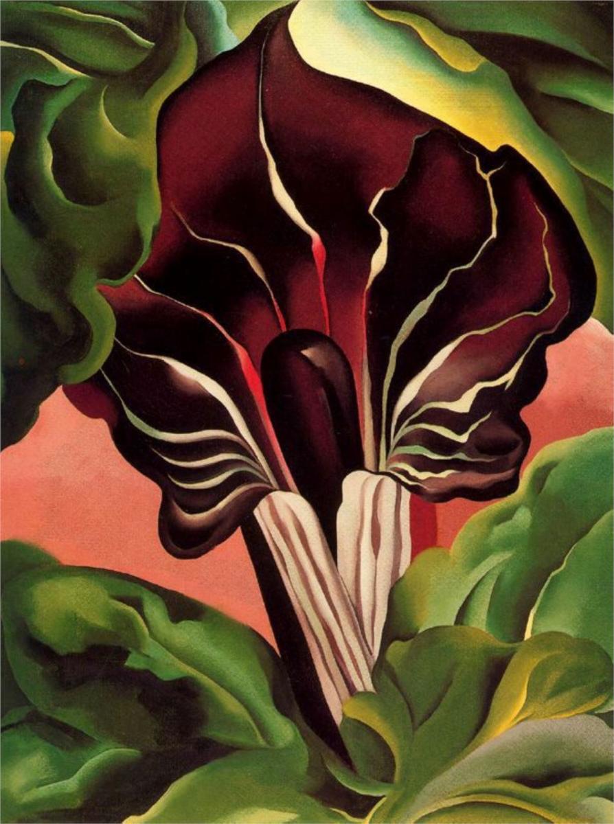
About this time last year, I wrote about an abstraction sequence I have my students create based on work by several famous artists. Picasso, Matisse, and Mondrian—like many other artists—took a subject and abstracted it over a number of pieces to see how far they could go making it more and more abstract. I was reminded of the lesson plan, yesterday, when I got to see a similar series of paintings by Georgia O'Keefe.  In these paintings, O'Keefe starts out getting more graphic, but then she also crops in closer and closer to the subject until she eliminates most of the context for the shapes and colors.

Georgia O'Keefe, Jack-in-the-pulpit

Her progression reminded me of a similar project I did as a first-year art student. There are three parts to it:
  1. Over five steps, move closer in to the subject.
  2. With each step, as you crop in, also simplify the shapes.
  3. With each step, use a relatively darker set of values so that the five steps reflect a full value range from high key to low key.
Abstraction Sequence by Brian Jacobs, 1985

This is a great project for students because it gives them a very concrete objective. It's easier to be creative when we are constrained by a certain number of panels and a distinct set of directions. Beyond the constraints, we can come up with our own ideas. But the constraints force us to focus.

The assignment also gives us context; it's easier to understand your final color scheme when you've started with a light set of values and worked darker. The same is true of the simplification of the shapes: it's easier to abstract in smaller steps. By the time we get to the last panel, we are organizing the painting in terms of design, not realistic representation.

O'Keefe's series is similar. We do not have the first painting in her series.  But if we compare Jack-in-Pulpit – No. 2 to Jack-in-the-Pulpit No. 3, we can see that she is simplifying and hardening the edges. By No. IV, some of the previously rounded forms have become more square. But also, at this point, she starts cropping in closer to the inside of the flower. When she gets to No. VI, we sense that it references life, and from the context of the rest of the series, we know it is the spadix of the flower. But now our focus is on pure form. Using O'Keefe as a model, students can create their own progression to learn about abstraction as well as color and value.

CR 716 Jack-in-Pulpit – No. 2, 1930

CR 717 Jack-in-the-Pulpit No. 3, 1930

CR 718 Jack-in-the-Pulpit No. IV, 1930

CR 719 Jack-in-the-Pulpit No. 5, 1930

CR 720 Jack-in-the-Pulpit No. VI, 1930

One of my mentors always used to say, make small changes. He meant that we should advance our style and work through our ideas by making a number of works that are each slightly more developed toward the goal than the one before. This assignment is good preparation for that kind of practice. In addition, the relatively arbitrary combining of objectives makes it easier to make connections and discoveries.

Saturday, September 14, 2013

The day job

—Creativity—

In Europe, centuries ago, an artist may have spent free time on his or her own projects and a lot more time building sets for Easter pageants or altars for churches. Back then, as it may still be in some cultures, art was a trade like any other profession. But we now live in a world where artists often have two separate occupations: a day job and their craft.

This is the norm, though we often feel badly about it. Day jobs, we tell ourselves, are necessary evils while we are getting started but real artists don't have day jobs. And yet, a quick internet search reveals many, many famous artists who worked non-art jobs their entire careers. Most of the dual-profession creatives I learned about are writers, only because they tend to write about themselves. But visual artists also have to work side jobs. Sometimes we work jobs that simply help us survive. Paul Gauguin claimed to have emptied bed pans in an insane asylum to support his art. Been there, done that. Jobs like this are only short-term solutions to desperate situations. But there are advantages to getting a good, permanent day job.

A secure, sustainable, livable salary can only make it easier to be an artist. When one has enough money (and that doesn't have to be a fortune for the starving artist), free time is unencumbered by the stresses of survival. These stresses can seem to dominate every hour of every day when we are in survival mode. But when the bills are paid and the refrigerator stocked, we can come home and get a couple hours of good, solid work accomplished. Most artists create better when they are able to get into a healthy flow with the work. Time helps but money, in many ways, helps more.

When your time for art is limited by your day job (time is always limited), you will hopefully find yourself using your time more aggressively for your art. This is where a good day job and a bad day job differ. Coming home from a job that doesn't even pay the bills does not inspire hard work at home. After all, you just worked your tail off for not very much at the office. But when the hard work at the office pays dividends, then you will want to keep reaping benefits at the easel as the day dissolves. Having limited time to make art forces us to focus more, cut straight to the essentials, and get our work done. Having money in the bank gives us permission to indulge in our craft instead of poring over bills and making emergency runs to recycle bottles and move cash around from one ATM to another.

Having financial security means that it is easier to carve out regular time for the art without interruptions. But there are other ways that a good day job can introduce routine to an artist's life. The regularity and responsibility of a day job means that your routines are set. Most successful artists structure their studio time in the same way as a regular job. Roy Lichtenstein went to work in his studio every day as though it were a nine-to-five job so that his family got used to the idea that his time there was essential. Having a regular job forces you to have a routine and hopefully teaches you how to maintain a routine after making it big and quitting the day job. Until then, your studio routine follows your day job routine.

We might see the day job as a distraction—and if it pays less than we need to live, it really is, as it would be for anyone. But a good day job gives us security and makes it easier to maintain discipline in our craft. A meaningful, healthy day job provides social interaction outside the studio. It gives us skills we can use in our art business: bookkeeping, marketing, construction, Web design, billing, accounting, and more. The seeming incongruity of some day jobs and art making also offers perspective that we otherwise wouldn't get if we saturated ourselves with non-stop creativity. Anyway, there's only so many hours a day we can create. I find that I can work a day job more hours than I can paint, because making art takes more energy than most other occupations. And art requires contemplation or at least stepping away.

Having a day job means something else that Oscar Wilde acknowledged when he wrote, "the best work in literature is always done by those who do not depend on it for their daily bread." Financial independence from the art world means that one doesn't have to compromise vision for salability. Often, our best work has financial value only later. Financial independence from art trends means one can challenge the trends and do something different, something that doesn't yet have currency.
"Make some sacrifice for your art and you will be repaid but ask of art to sacrifice herself for you and a bitter disappointment may come to you."—Oscar Wilde
These days, however, everything takes more energy and time and money than it did a century or even decades ago. Most professions demand 110% from employees (a mathematical impossibility). Most professions demand that instead of going home and writing the novel at the kitchen table, we go home and continue working on the laptop, doing research and professional development, or catching up on unfinished office work. Many famous creatives admit to stealing time at the day job and working on their art on the sly if they had to. One way or the other, there's no room for both the day job and the art career to occupy ALL of our time.

But the two occupations are not inherently incompatible.  Being an artist is more of a cultural and social role than a financial occupation. This is not to say that artists should not make money or want to be compensated. We know that the calling to be an artist is outside our economy—just as a minister's or doctor's calling is outside our economy. But that doesn't mean that it is wrong to make money off the art. The art economy is largely distinct from our regular economy. So we don't need to experience conflict between a day job and a profession as an artist. They are two separate things. One  provides a secure cash flow to invest in the other, but that investment is intended to pay off at some point, to some degree. Selling art in the art economy is more like receiving patronage, even in today's art marketplace. When we let art slip into the regular marketplace, we risk corrupting it more.

So getting that day job and using it well is a challenge. But if we can use it as a financial resource, it can benefit our art making, as long as we can safeguard the time we have left after the work day is done.

Thursday, September 12, 2013

Building cardboard flat files

—News from the studio—

A pile of my prints.

Often, when I find a need for some resource in the studio, I will build it myself. This week, while in the process of organizing and documenting all my artwork, I found that I needed some flat files to separate and store my prints, drawings, and small paintings. Here's the story of how I found a cheap solution.

I began with a bunch of free boxes. I cut them in half and shortened the width of the side flaps so I could reassemble them only as deep as a strip of 1x2. This meant that the front and back flaps also had to be cut down to the same size.

Cutting down the box using my mat cutter.
Measuring the height of a 1x2.
Side cut to fit 1x2. The end flap isn't cut down yet.

For the 1x2 strips, I found eight foot sticks made of recycled wood fiber for $2.24 each. They come coated with white primer, so they were a perfect choice. I cut two pieces from each stick for the sides of the flat file and stapled the cardboard to the wood. Now, I had two parts for the flat file: a top and a bottom.

Stapling the cardboard sides to the wood

I stacked the top and bottom pieces and stapled the loose cardboard to the tops of the 1x2s on each side, leaving the staples off about 1/3 of the length from the top so I could make a larger top flap. I only had to staple down one half of the top and bottom since the cardboard wraps around and is stapled on the sides. To make the flap, I very, very lightly scored across the top with a utility blade. When making boxes, I always score the side that bends in.

A flap cut in the top for easy access.

I taped the flaps down in the back; they never need to be opened.

The back flaps are permanently taped.
The front ones can be taped closed with less tape as needed.

And here are my six finished flat files. I've already got one in use. They are light, sturdy, and easy to stack. And they each cost me only $2.24 in materials.

The flat files completed.

The first one with paintings stored and the flap labelled.